
If you are, like me, at an age where AARP solicitations constitute half of your mail, then you’ve probably noticed that you can’t read highway signs at night as easily as you once could.
Turns out this is a pretty complicated issue, which is why it’s the subject of a giant experiment on Interstate 93 in Concord.
“There are several levels of highway sign sheeting that are used, but to simplify the discussion, they can be grouped in three categories: Engineering grade, Hi Intensity Prismatic, and Micro-Prismatic,” is how William Lambert, who has been the state’s traffic engineer for 15 years, explained the issue to me in an email – which, if nothing else, shows that the phrase “to simplify the discussion” means something different to an engineer than it does to most of us.
Lambert was writing me because I had approached him on a related topic: the fonts used to write highway signs. This is also surprisingly complicated and became controversial last month after the federal government pulled a U-turn on the topic.
Here’s the backstory, gleaned from various sources with Lambert’s help.
The standard highway font, called Highway Gothic, has been around since at least the 1940s and has become codified in the Manual on Uniform Traffic Control Devices, the federal guidebook for road and highway design in the U.S.
Why care about fonts? Because it’s hard to create signs that can be read accurately by people who speed past in all sorts of conditions, especially signs that can be read easily both in daytime, when they are illuminated mostly from above, and at night, when the illumination consists largely of light reflected from moving headlights beneath them. Font design – the exact shape, thickness and spacing of letters and of words – plays a big role in making this work.
In 2004, the federal government replaced Highway Gothic as its recommended font with Clearview, which looks very similar to laymen but was tweaked to help older drivers at night.
In particular, the shape of several lowercase letters like “e” “o” and “s” were changed in Clearview to compensate for halation, a term for light spreading beyond expected boundaries to form a visual fog or blur. Older eyesight is particularly susceptible to halation.
But then, after 12 years of using that standard, the U.S. Department of Transportation suddenly announced in February that it didn’t like Clearview anymore and would not approve it for future signs. The resulting kerfuffle led me to contact Lambert to learn more.
The Clearview decision was reached because real-world experience showed it was less legible, not more, on signs that have dark letters on light backgrounds, such as speed limit signs.
As for highway signs, which have light letters on a dark background, Clearview didn’t actually help at night: “After more than a decade of analysis, we learned that retro-reflective sign sheeting materials that direct a vehicle’s headlamp beams back to the observer were the primary determining factor in improved nighttime visibility and legibility.”
Now you understand why Lambert was emailing me about reflectivity when I asked him about fonts.
Engineers realized long ago that words and signs need to reflect headlights to be readable, since you can’t put lights on every highway notice.
“The first technology was ‘cats eyes’ – reflective buttons within the copy” that mimicked the shape of each letter inexactly, Lambert said.
Decades ago, it was replaced by glass beads embedded in sheeting, which made the whole letter reflective and much more readable.
In the 1990s, “sign sheeting manufacturers developed the bright reflective sheeting” that uses zillions of tiny little embedded prisms to better reflect light.
This stuff comes in two types. One is high-intensity prismatic, which is more durable and brighter but reflects light like a mirror, bouncing it away from the direction it arrives. (Recall “angle of incidence equals angle of reflection” from physics class.)
The other type is micro-prismatic, which reflects about two-thirds of light directly back in the direction it came – in this case, back down at cars instead of up.
Micro-prismatic design appears brighter to drivers for obvious reasons, so we should use it all the time, right? Wrong – which brings us to the experiment.
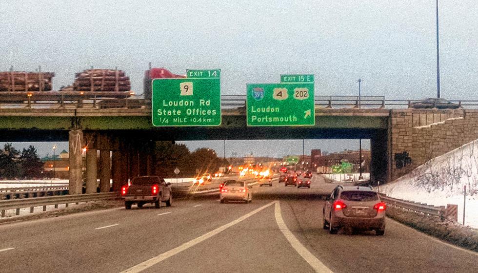
In the southbound lane of I-93 in Concord, two large signs hang on the I-393 bridge. One tells you that Exit 15-E takes you to Loudon and Portsmouth, one tells you that Exit 14 will take you to Loudon Road.
The Exit 15-E sign has micro-prismatic coating on both the sign background and the letters. The Exit 14 sign has micro-prismatic coating on the letters and high-intensity coating on the rest of the sign.
They were installed at the same time in what the technology world calls an A/B test, where two slightly different versions of the same product are created to see which performs better.
Lambert says it was no contest. The sign with two different coatings is more easily read due to contrast. This two-different-coating approach is now the standard for all state highway signs.
I drive under these signs all the time and had vaguely noticed something different about them. After Lambert pointed it out, I traveled beneath them at sunset and it’s definitely true: With headlights on, the Exit 15-E sign is more washed out and harder to read.
All well and good, but what about the Feds’ switcheroo on highway fonts, the issue that made me call Lambert in the first place?
It’s a non-issue for New Hampshire, Lambert said, because we never adopted Clearview for our highway signs in the first place.
Highway Gothic is free but Clearview is a propriety, private font: To use it, we’d have to buy the license. The cost is minimal – $759 for the entire typeface family of 13 fonts per municipality – but as you can imagine, the idea of buying something we could get for free didn’t go over well, so we stuck with Highway Gothic.
We’re not alone. Almost half of states never adopted Clearview, so road signs across the country are a mix of Clearview and Highway Gothic, although most of us don’t even notice.
Incidentally, neither in 2004 nor today did the federal government’s ruling require existing signs to be changed. These standards apply only to future signs, not retroactively.
As for me, next time I’m able to read an exit sign at night without squinting too much, I will give thanks to micro-prismatic and high-intensity prismatic contrast.
Hopefully I won’t do this out loud, however, or else my passengers are going to get very worried.
(David Brooks can be reached at 369-3313, dbrooks@cmonitor.com, or on Twitter @GraniteGeek.)
 Return to the Concord Monitor
Why not have highway signs in UPPER case lettering? Makes it easier to read. Besides, there has never been a lower case snellen eye chart.
I started to get into lower vs. upper case but the column is already so long I cut it out. In the 1940s the federal design guidebook did allow all-caps signs, but that was ruled out after more readability research (although, as this story demonstrates, readability research isn’t perfect).
A mix of upper and lower cases is considered easier to read than all-upper-case text in most contexts, partly because the caps can provide extra information about the content, such as flagging important words or proper names, and partly because lower case letters have a greater variety of shapes to help them be understood at a distance.
One nit: ‘Cat’s Eyes’ are a name for reflective road studs, first used on British Highways. The practise has spread worldwide. In America the parlance is RPM(reflective pavement markings). Signs with reflective buttons in embossed letters is coiqually known as ‘Button copy’. There is no official name for it.
Nice article, but I need to clarify one statement: “In 2004, the federal government replaced Highway Gothic as its recommended font with Clearview”. In reality, Clearview was approved by FHWA as an alternate font with Highway Gothic remaining as the primary font. Most states did not adopt Clearview or used it sparingly. However, states like Pennsylvania and Texas were major users of the Clearview font.
David Woodin, Director – Traffic Operations Bureau
New York State Department of Transportation