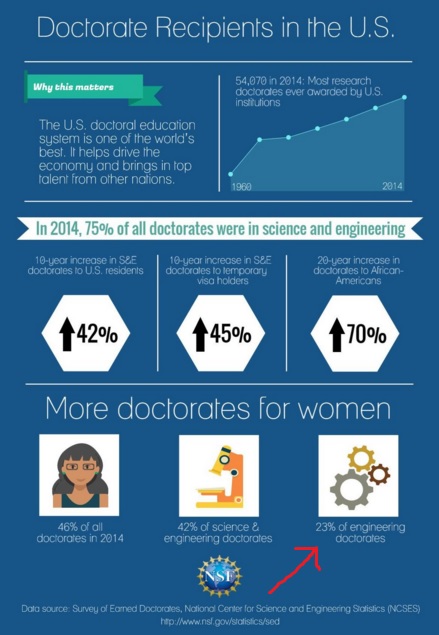
Three interconnected gears can’t move, but three interconnected gears look cool, which is why graphics designers love to use them as a symbol for engineering – much to the frustration of engineers.
I see it all the time – most recently in the above graphic, Tweeted out from the federal government for a survey about doctoral degrees in the country. (I drew that clumsy red arrow to point out the error.)
Note that the graphic does not appear on the actual report from the National Science Foundation, which is reassuring.
Gears and illustrators are doomed to be incompatible, because any odd number of interconnected gears will seize up, but an odd number of things looks better in illustrations than an even number of things. There’s even a “rule of odds” taught to new designers to impart such wisdom.
GraniteGeek cannot sneer too much: The original logo for this column when I came to the Monitor had three letters turned into gears and, yes, interlocking. Fortunately, I spotted it before it went public.


 Return to the Concord Monitor