
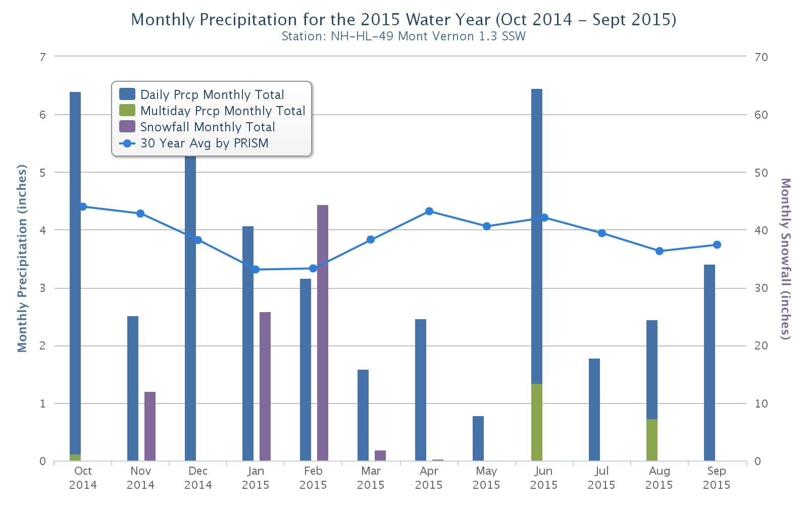
The above chart shows my measurements during the “water year” of Oct. 1 through Oct. 1 (an arbitrary period used by meteorologists to analyze precipitation). I make measurements as part of CoCoRaHS, a regional citizen-science precipitation-gathering group.
Blue is monthly totals for “daily precipitation” – either rainfall or melted snow – while purple, measured on the right scale, shows snowfall totals for the month. One foot of snow can hold anywhere from less than an inch of water to about three inches. Green is “multiday” measurements when I missed one or more days, such as during a vacation, and put in the total precipitation during all those days when I return.
The 30-year normal line is an estimate of precipitation from the PRISM Climate Group at Oregon State University for my area – it’s not exact to my yard. I’ve only been doing it for 4 years.
The big thing that this chart shows is how dry the spring and summer have been, except for those June almost-floods. Erratic is the new normal when it comes to precipitation.
 Return to the Concord Monitor