
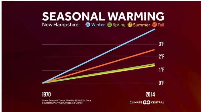
Today’s depressing weather chart is shown above, taken from this analysis by Climate Central. It shows that on average, winter temperatures in New Hampshire (presumably meaning Concord, where the National Weather Service has its official site) have risen four times as much as temperatures in summer. This is due at least in part to feedback from less snow, which means less ground cooling and less solar reflection, although I’m sure there are many other complicated factors at play.
Speaking of being at play, this winter sucks so badly thus far that ski areas which opened earlier in December have closed again; it’s too warm to make snow.
The chart, as the page notes, “displays a linear temperature trend for each season fitted to monthly average temperatures from 1970-2014. While the trend is shown as a straight line, the overall warming we experience does not always follow a consistent path upward. It undergoes yearly variability — on top of the seasonal and regional variability.”
 Return to the Concord Monitor
what is the significance of the 1970 start date???
A function of the dataset, I believe – no climatological (is that a word?) significance.
the 70’s were notoriously cold winters…correct???
I checked weather history for Concord on Weather Underground – degree days for Dec. 1 to March 1, for a number of winters – and 1970 didn’t seem out of the ordinary.