
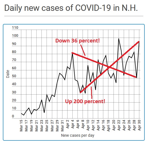
We all know that when dealing with an erratic data set, choosing end and start points to trend lines makes all the difference.
The state’s daily count in confirmed COVID-19 cases is a perfect example – as my amateurish illustration (Microsoft Paint doesn’t seem to have a turn-lines-into-arrows feature) demonstrates.
 Return to the Concord Monitor
Did you mean to flip the X and Y axis labels?
dang – when did that happen? Infogram is a bit squirrely at times