
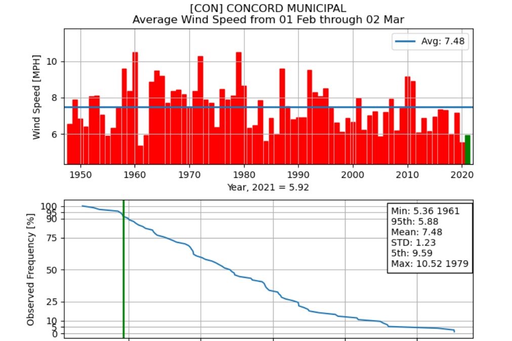
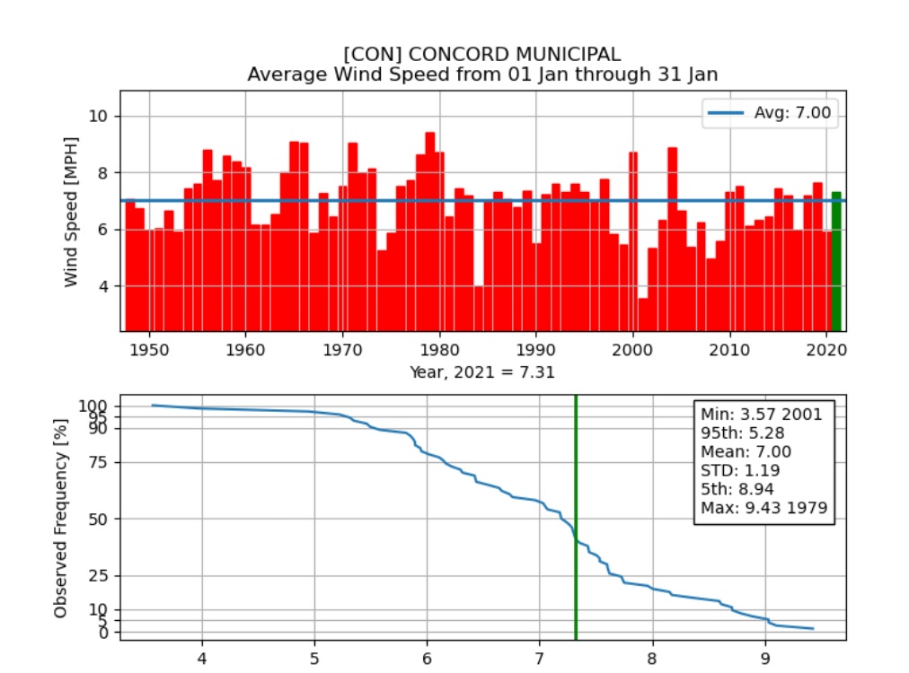
It’s very windy today in New Hampshire – lots of power lines down but not the ones to my house, thankfully. I’ve posted a couple items about wind speeds at Concord Municipal Airport, the National Weather Service’s official measuring spot, in response to reader comments that it seems windier than it used to be. I just got another such comment so I went to this site and made a couple of charts, which show that January was slightly windier than the 75-year pattern as measured by average (mean) speed over the month, but February was much less windy than normal.
In fact, Februaries have been less windy than the average, sometimes much less windy, this entire decade. I wonder if that’s significant? Hmm …
Wind measurements change a lot from place to place so it might actually be “windier” around your home than it used to be (were any trees cut lately?) even if it isn’t windier at the airport.
The top chart with red bars is easy to read – the blue line is the long-term average and this year’s monthly average is written underneath the X-axis label. The bottom chart with the blue line is a little more confusing; it shows the distribution of monthly results over the entire 75-year period; the green vertical line marks where 2021 falls on the average. Note that the Y-axis is logarithmic.
 Return to the Concord Monitor