
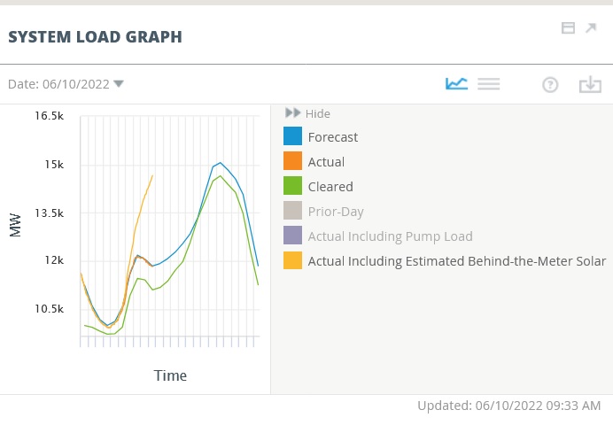
If you need yet another distraction online, take note that ISO-NE has improved their realtime chart of the 6-state grid’s system load, incorporating behind-the-meter solar (i.e., rooftop) directly into the chart. Previously you had to toggle a switch off and on and compared the results by eye.
It’s amazing how much rooftop solar has been added around the region. N.H., alas, is a laggard.
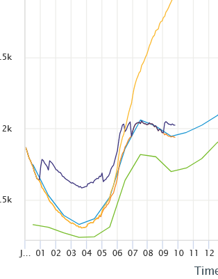
That “actual including pump load” can include the input or output from the 1,200 MW Northfield Mountain pumped storage hydroelectric station in Massachusetts. (I don’t think there’s any other pumped hydro on the system, but I’m not sure.)
It’s complicated because it’s a battery not a producer – sometimes it draws power and sometimes it releases it. Here’s what pumped hydro (purple line) looks like if turned on:
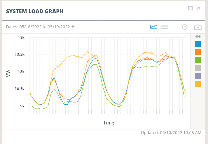
The chart also lets you look at two days in a row from the past. Matt Kaley of ISO-NE suggested looking at May 18 (which was sunny) and May 19 (cloudy) w/ BTM PV turned on. The top of the curve is similar for both days, but look how much rooftop was produced on 18th but not the 19th. That’s why grid operators find distributed energy something of a headache.
 Return to the Concord Monitor