One of the poorly understood aspects of COVID-19 (one of many) is that it affects males more severely than females, if I may be binary when considering gender. This July study on the CDC page, for example, found that globally, “the overall COVID-19 case-fatality ratio is approximately 2.4 times higher among men than among women.”
Is that true in New Hampshire? You bet. The state’s interactive COVID-19 dashboard shows it.
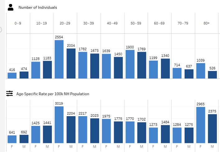
For all age groups, New Hampshire women and men get COVID-19 at about the same rate. (The light blue bar, on the left of each age cohort, is female while dark blue is male – the top chart is absolute numbers, the bottom is per-capita):

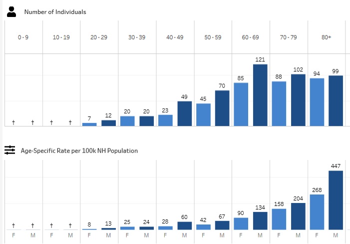
But men are hospitalized with COVID-19 more than women in virtually all age groups:

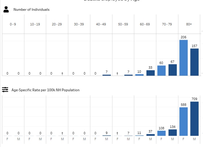
And men die of COVID-19 more than women in all age groups:

Note than women over 80 have more absolute deaths because they greatly outnumber men over 80. A little arithmetic based on these numbers indicates there are 35,000 women over 80 in the state but just 22,000 men.
Why do they outnumber men? Because COVID-19 isn’t unusual – males die more than women of many causes, particularly trauma, in all age groups. The natural birth ratio of people is about 5% more male babies than female babies to compensate for this imbalance.
Males are the weaker sex by any measure other than ability to open stuck jar lids.

 Return to the Concord Monitor
The graphs are nice but lack information about the time frame being covered. The axes are not labeled, either. Hmmm.
I forgot to link to the Dashboard itself so you can check this -I have added that link.
The time frame is the entire pandemic. The axes are labelled but not in the usual way – the X axis is age groups, as shown at the top of each charter, and the Y axis is totals, which are given at the top of each bare.